JR: Chronicles
JR started as a graffiti artist at 15. What changed his style of street art was when he found a camera on the underground. He took pictures of people's faces up close. He gave his friends p/copies of the photos he took and then pasted his work up in the streets, creating a sidewalk exhibition.
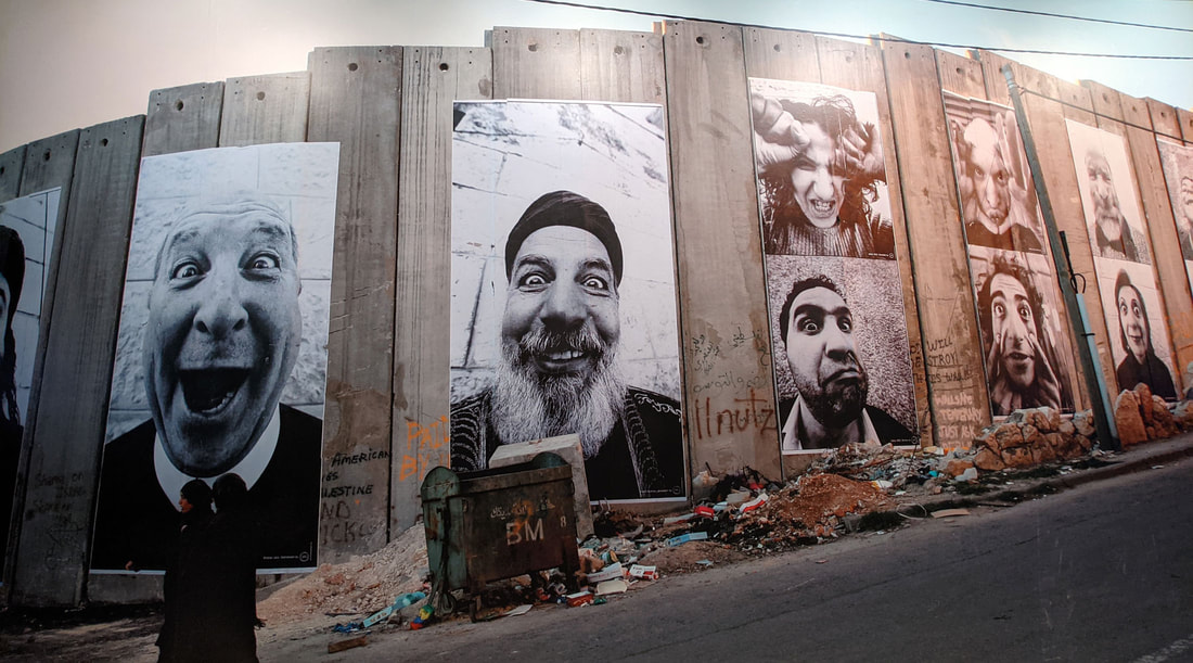
During the riots in les boquets, JR wanted to show a different side to the people involved in the riots, that they are not all violent. In the Portrait of a Generation project, JR wanted to show to people that we are all the same on the inside. He used a 28mm lens and had to get really up close. He asked everyone he photographed to make a face that represents them.
I don't think it can change the world but I think it can make people stop and rethink in some cases.
My favourite series was the Face to Face project where he put pairs of images of Israelis and Palestinians on the separation wall.
My response
I asked Tom to express himself, how he is as a person.


|
This is the photo that Tom chose because he thought it represented him the best. JR let the model chose the photo so that they could reclaim their identity. |

|

Gordon Magnin


Gordon Magnin creates artwork offers a new perspective of a very familiar subject matter in an extremely refreshing way. He does this by imposing geometric systems on the high fashion faces, by cutting out the images. He wanted us to consider a new perspective of a very new perspective in a new refreshing way.
The artist mainly uses found female fashion images. He imposes geometric systems normally triangles or squares this piece of work. This is shown by the editing he makes on photoshop, which disfigures their faces with different shapes.
Did you do you create a Magnin response? If not, delete this.
The artist mainly uses found female fashion images. He imposes geometric systems normally triangles or squares this piece of work. This is shown by the editing he makes on photoshop, which disfigures their faces with different shapes.
Did you do you create a Magnin response? If not, delete this.
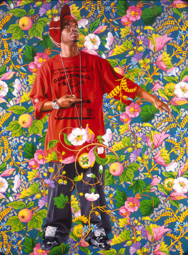
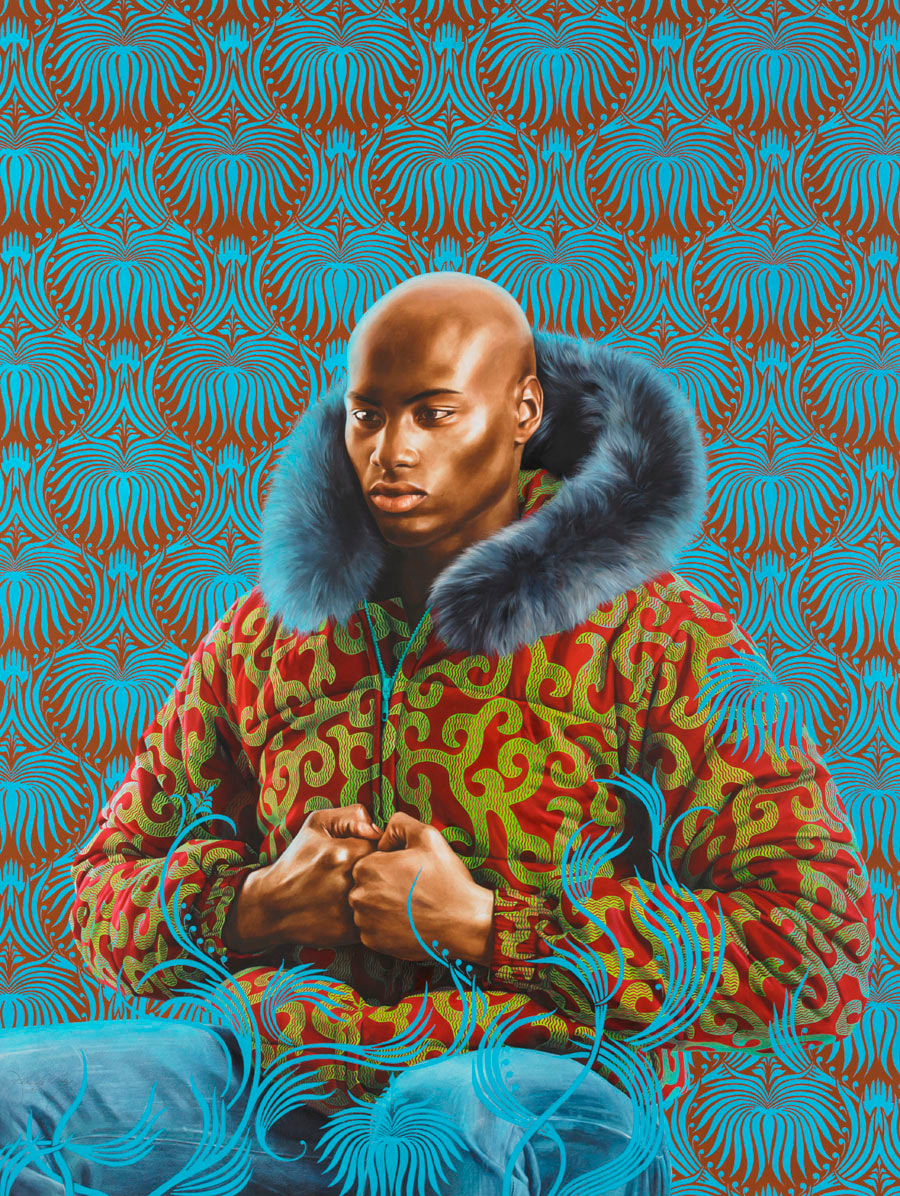
Kehinde Wiley
Paintings from van Dyck's era were meant to capture life as it was exactly. Kehinde Wiley made backgrounds of soft stuff like flowers to show that the intimidating person in the photo wouldn't look so intimidating when he blends the background with the person.
|
|
My Response
In these photos I tried to recreate classic poses.
Edits

|

|
www: I took a portrait photo of tom and edited it with a background of my choice.
ebi: I had completed the task in one lesson.
ebi: I had completed the task in one lesson.
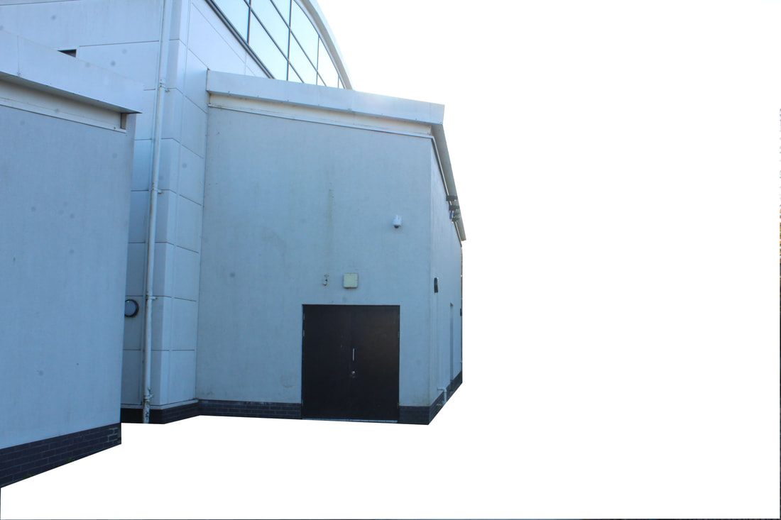
Patrick Cornillet
Cornillet is a painter, not a photographer. In this series, he has painted architectural elements isolated from their environment and reconstituted them in the form of objects on a white background. The concrete makes us aware of the material and of the remains left by the humans and of time passing by. Even if the architectures seem austere, spaces seem uninhabited, dehumanised, Cornillet creates particular poetry and a mesmerising mysticism.


My Response
Best Edits

|
|
www and ebi
Mauren Brodbeck
The buildings and car parks in Mauren Brodbeck’s photographs do not register in the thoughts of passersby. They are so unimposing that their existence seems almost doubtful. We pay so little attention to them that we can’t recall what they look like, they leave a mental blank. Mauren Brodbeck registers this secret to memory and changes it into a visual moment representing space and time.


|

|
|
First you open your photo on photoshop. then you can select your building with this tool--------------------> After that you can choose a colour here: |

|

After that you can choose a colour above.
|
www: I liked this task, I managed to complete the task efficiently and made a gif photo as well
ebi; I had taken some more specific photos. what do you mean?
ebi; I had taken some more specific photos. what do you mean?
Thomas Kellner
Kellner's’ work shows us segments of the total which come together as one image. His photographs do not necessarily deconstruct architecture but instead reconstruct our view of it. His work offers an alternative view of famous landmarks, one that intends to question our thoughts on how we visually process them and develop a sense of place. Kellner uses the traditional process of film photography to create montages. Using just one roll of film, Kellner often takes images of the same landmarks or buildings of significance from different angles to later re-arrange them on a contact sheet and create a unique composition.

|

|
My Response


I tried using gallery above to assemble the photos but it didn't look like Thomas Kellner photos.
so I used he program bridge and it turned out much more like his photos.
so I used he program bridge and it turned out much more like his photos.
www: I managed to create a photo like Thomas Kellner did it.
ebi:i had token more photos so could create another photo.
ebi:i had token more photos so could create another photo.
Two Strands
Strand 1: JR
The 'Inside Out' project is a platform that helps communities around the world to stand up for what they believe in and spark global change locally.

My Response


Strand 2: Patrick Cornillet
For my second strand I would like to develop my response to Cornillet further.
My Response


www and ebi
Development 1
My favourite strand is the JR strand. I like JR's work because it shows a different side of people who are willing to get out of there confer zone


I created posters like I did in the set task however, I changed it by making the dots and background different colours.
Brown colours worked well because its more realistic to their hair/skin
Yellow and brown also worked well you can see clearly where the head is and where the background is because th eimage is more contrasted.
I also thought red and black worked well because there is a big difference between red and black.
Yellow and brown also worked well you can see clearly where the head is and where the background is because th eimage is more contrasted.
I also thought red and black worked well because there is a big difference between red and black.
I photographed the posters around the school.


Development 2
|
In the second development, I wanted to create a series of images like JR's contact sheets.
|

|
|
|

|


I think used the white wall to my advantage and managed to take 20 photos 10 photo per person. Perhaps I needed to get closer for shadows and resolution
Development 3
|
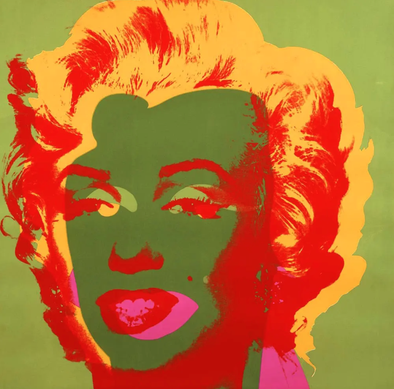
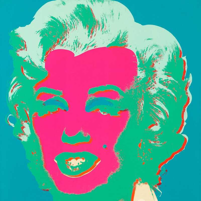
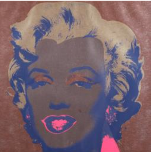
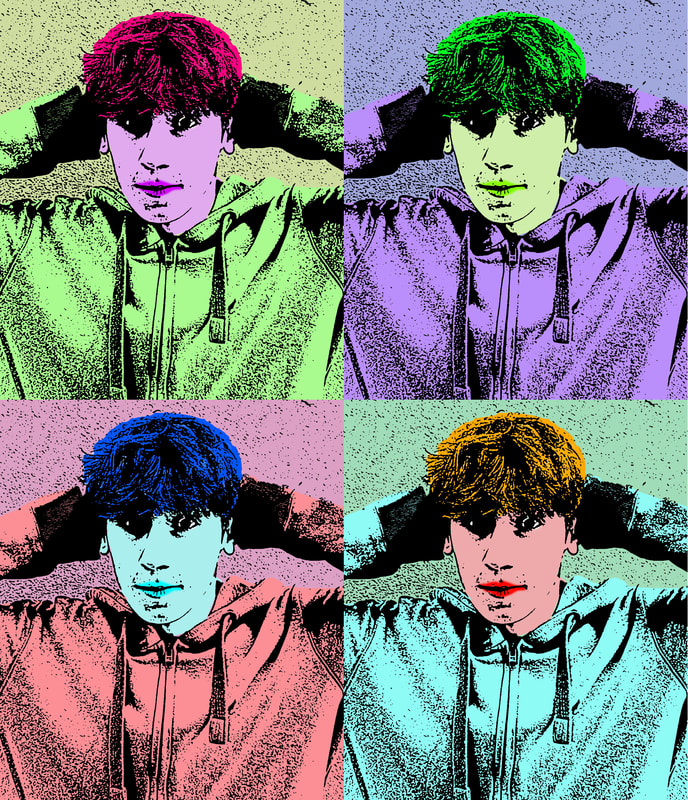
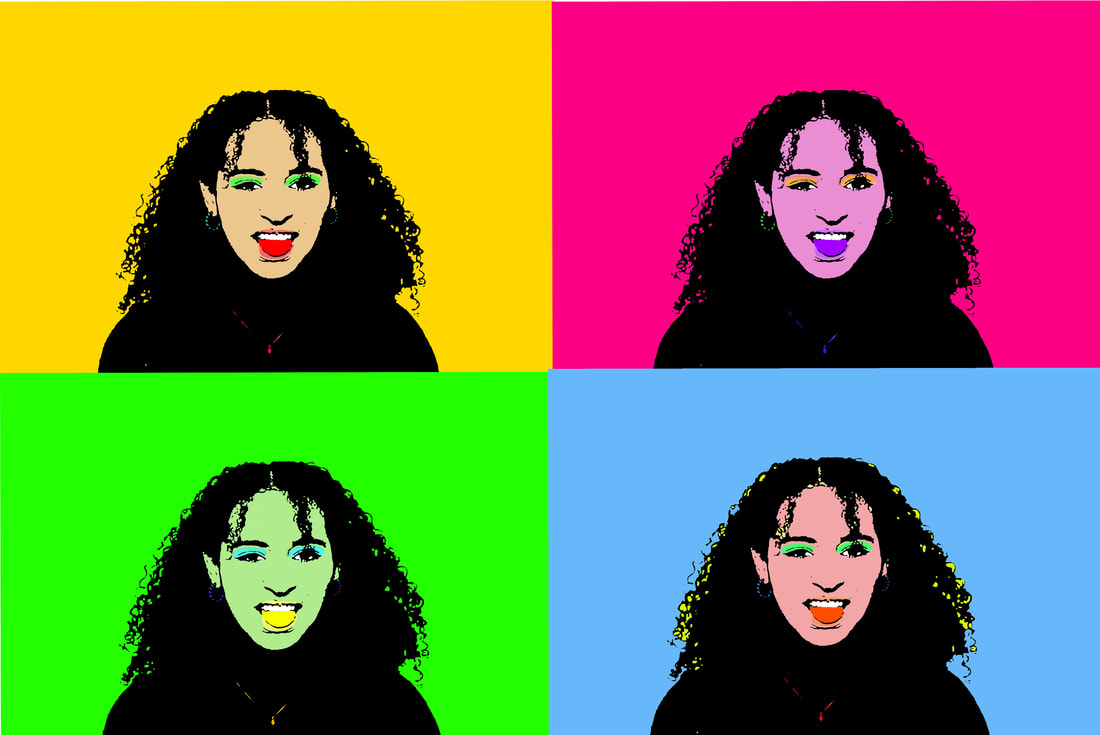
Andy Warhol
Andy Warhol created screen prints of Marilyn Monroe. Warhol made his first paintings of Marilyn Monroe soon after the actor died of a drug overdose on 5 August 1962. Warhol used a publicity photo for her 1953 film Niagara as the source image. The use of two contrasting canvases for Marilyn Diptych illustrates the contrast between the public life of the star, who at the time was one of the most famous women alive, and her private self. |

|
The four images below are from a set of screenprints produced in 1967. Warhol printed the same image in lots of different colour combinations.
|

|
|
|
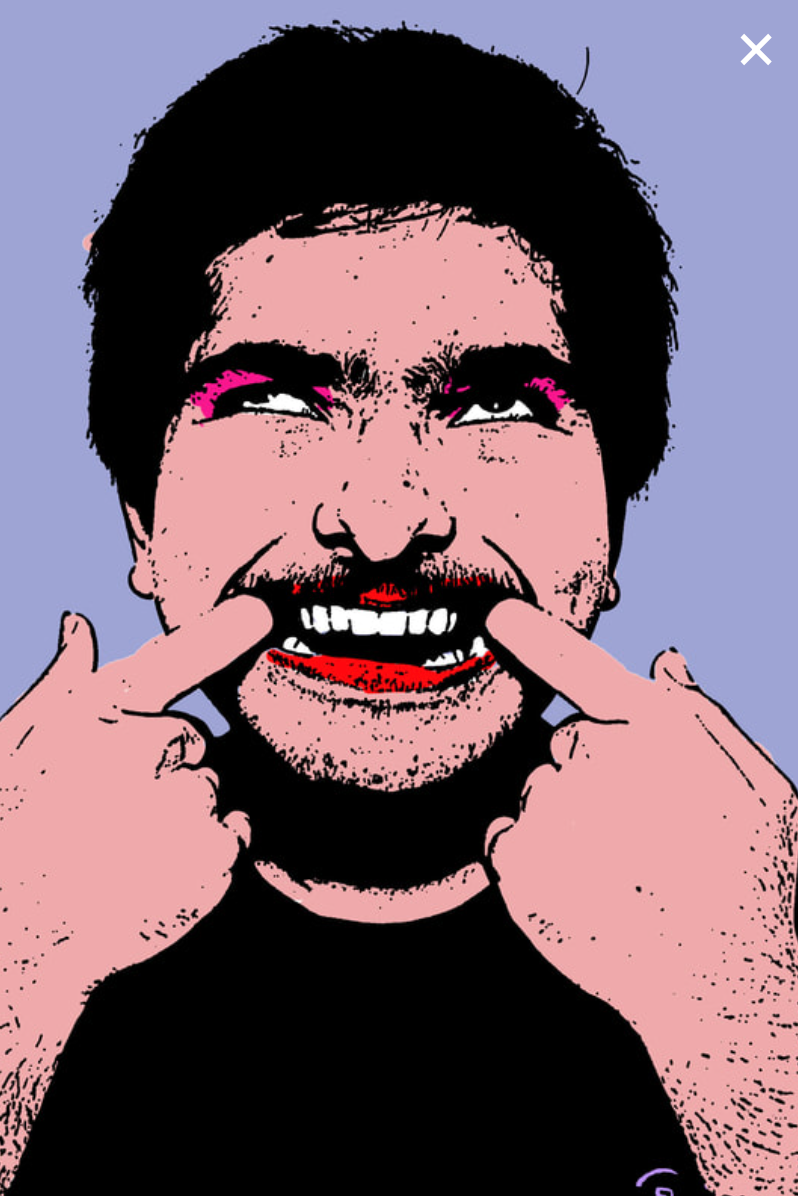
My response to andy warhol:


Development 4
I have developed Andy Warhol further by taking more photos.
I am also inpired by JR as i asked each person to express themselves with facial expressions.
I am also inpired by JR as i asked each person to express themselves with facial expressions.
Put the unedited images of Sophie here- Weebly mixed them up.


Weebly has mixed up the pics of Livvy too.


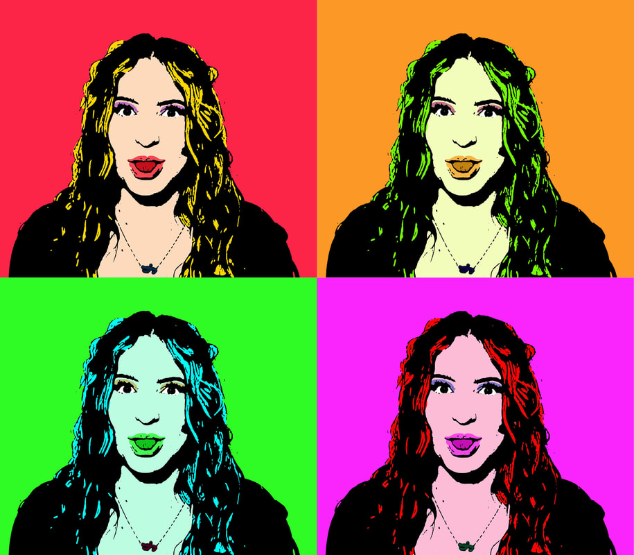
Having multiple edits of the same image works well however the colours are too harsh. I think the next set should use the colours from Warhol. When I edited the next photo i had a higher resolution which made my picture much better.
Development 5


Development 5


This is my absolute best project so far its my final piece and I really enjoyed creating my own mix of J.R and Shot Marilyn!
